Archive
Creating Pareto Charts in OpenOffice – Ireland in a deep hole
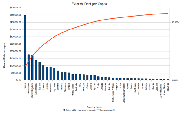
If you would like to create a Pareto chart with free software that looks something like the one below, then read on. If not, and you are only interested in the data, it can be found here

Creating a Pareto chart is simple in OpenOffice
This is a short tutorial on how to produce the chart in an OpenOffice 3.1.1 spreadsheet (using Ubuntu 9.10 Karmic Koala).
Step 1. Select your data In the spreadsheet.
(I moved my columns beside each other first and only selected 40 rows to simplify this charting example – columns B, C and D of the .ods spreadsheet file)

External debt per capita data
Step 2. Click on the chart icon on the toolbar (small red pie chart icon) and choose “Column and Line” chart type from the window that pops up. Click “Finish”.
Step 3. Now we want to add another axis for the accumulative percentage so make sure you are in Chart edit mode by right-clicking the chart and choose “Edit”, then right click the graphed line in the chart and choose “Object Properties”.
Select the “Options” tab from the window that pops up and select the radio button to align the data series to the “Secondary Y axis”. Click OK, to close that window.

We want the line data to be scaled with the Secondary Y axis
Step 4. Format the Y-axis that has just appeared on the right hand side of the chart.
(You may need to right-click the chart again to go into “Edit” mode)
Right click the new Y axis and choose “Object Properties”.
Under the “Scale” tab deselect the Automatic radio buttons and set values as shown here

Scaling the new Secondary Y axis
Now place the line of the axis where you can see (from the data) that the 80% mark has been crossed

Positioning the Secondary Y Axis
Now a final formatting to display the secondary Y axis values as percentages

Format Secondary Y Axis
Then click OK for these changes to be reflected in the chart.
Step 5. Format the X-axis to rotate the labels by 90 degrees.
Right-click on the X-axis and choose “Object Properties”, then the “Label” tab and set the rotation to 90 degrees.

Rotate the label of the X Axis for clarity
Step 6. Move the Legend (to make room for the graph data to the right, you may not need this)
While in edit mode (double-click the chart if required), then go to the menu “Insert” and “Legend”.
Place the legend at the bottom.

Moving the Legend to bottom of chart
Step 7. Finish off with labelling the title and axes
Double click the chart again to enter edit mode and from the menus, choose Insert, Title.
Complete the values for Title and the axes in the window that pops up and then close it to see the results.

Name the chart and its axes as appropriate
Voila! A neat looking Pareto chart with completely free (as in speech) software
Given that this data is prior to the Global Financial Crisis, it doesn’t look like the good times are coming back to Ireland any time soon.
Note the complete absence of Iceland from the data also.
What you said…